 There's a running joke in some circles that Drupal is a very user-friendly CMS; it’s just picky about who its friends are. That is actually quite true; Drupal is rather opinionated about how a web site should be built. Fortunately, its opinions align very closely with trends in the design world.
Design Systems
For those who haven’t gotten the memo, designing web sites as a series of static pictures is dead. In 2015, professionals don’t put pretty picture pages on the web. Instead, they build Design Systems. A system is a set of interconnected parts forming a complex whole. A design system is exactly that: It breaks down the whole of a web site into individual parts that can be designed independently, but recombined in various ways. The terminology varies depending on the technique that is used. Style tiles, atomic design, design components, all point to the same concept: Break a design down into constituent parts that can be freely recombined to form a greater whole.
The benefits of system-based thinking (whether design or otherwise) are many. In particular, it allows for much better consistency across a larger design (such as a web site), which in turn improves usability. It is far more efficient to design a reusable system than to build dozens or hundreds of special snowflakes, too. Most important, it means the design can evolve. Few web sites stop evolving once they're launched, so having a design that can flex and grow with the needs of the site is critical for sustainability.
Atomic Design, specifically, calls out three layers of parts: Elements, Components, and Templates.
- Elements are the individual HTML elements of the page, the basic primitives.
- Components are the design-language primitives. Think header, footer, navigation area, "hero" callout, etc. They are built out of Elements.
- Templates are generic full page designs, composed of Components. Think "event page", "home page", "listing page", and so on.
It turns out that Drupal is extremely good at building sites that use that sort of design. As an example, let's dissect PRI.org (The website of Public Radio International), a site we built at Palantir.net using those exact principles.
Designing Elements
Element design is the least Drupal-centric part of the process, so we’ll talk about it the least. Before discussing broad layout, let’s start with individual elements. What will an <h2> tag look like? How will a <blockquote> be used, or will it? What is the line spacing and vertical rhythm of the site? These considerations should be determined up-front, independent of any particular page or template, so that they are consistent across the entire site. Few things are as jarring as headers being a different size on every page, and used inconsistently.
Designing Components
To know what components to build, we need to understand the content we're building them for. Designing without knowing the content is virtually guaranteed to result in a failed product that everyone hates (even if they pretend otherwise just to get the site launched). That means understanding both the structure of the content in the abstract as well as its visual components. In other words, a successful design is impossible without Content Strategy.
In PRI's case, there is really only one significant content object: A Story.
A story consists of a number of elements, among them:
- Title
- Date
- Section
- Author
- Program
- Lead text
- Body text
- Lead image
- Lead image caption
- Taxonomy
There are various other elements, omitted here for space. Each of those correspond, roughly, to an Element. They also correspond, roughly, to a Drupal Field. If they didn't… how would we know how to enter content for those Elements? (There may be other display-only elements, such as share links, that are not part of the content model but those are few and far between.) The Story itself is a Drupal content type.
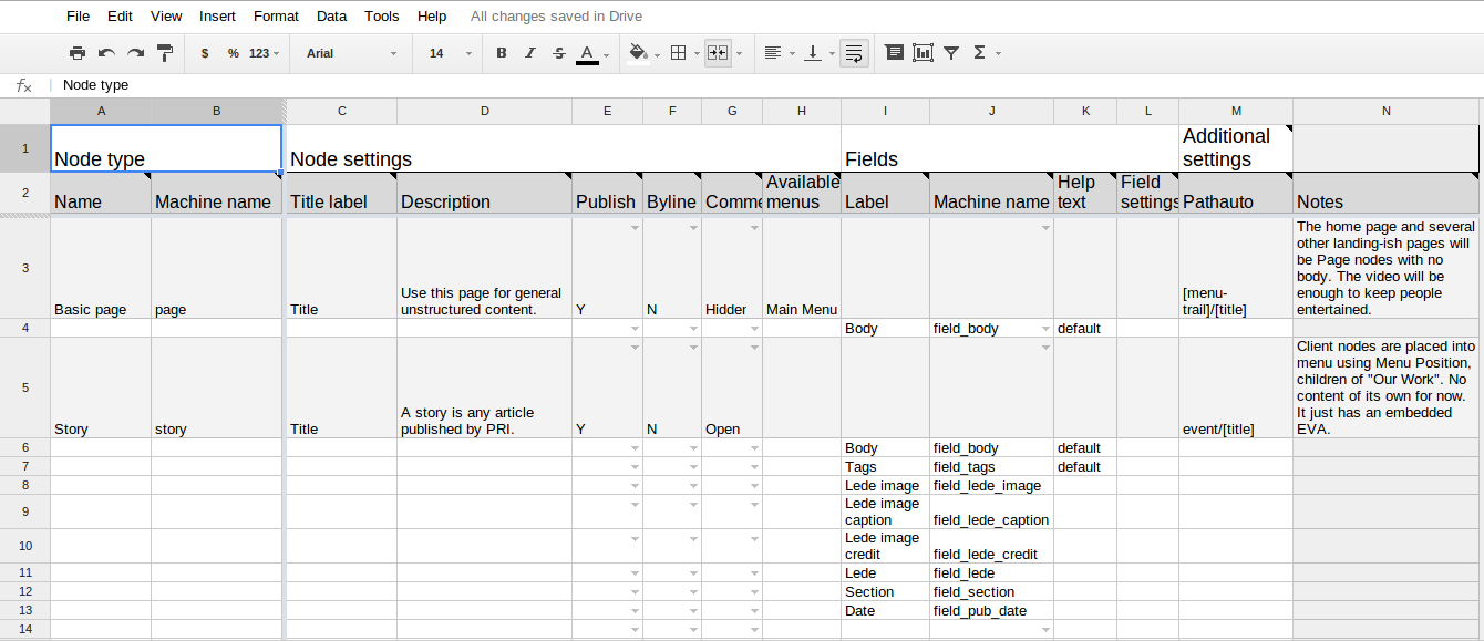
At Palantir, we've developed a tool called the Build Spec for mapping out all of these elements/Fields, and the content structure of both the design and the Drupal content model. It’s built as a Google Spreadsheet, and is freely available to use. See Figure 1 for an example.
Now that we know how our Story will be structured, we can design Components for it; i.e., different ways of presenting the same information. Let’s say, for instance, that on the homepage we want to show some featured story.

We can quickly identify some, but not all, of the elements of our story. The section is shown just above the lead image, while the title is shown above the program and date, followed by the lead text. Are there other parts of the story? Sure, but they're not relevant in this “Lead Feature" Component.
We also want to show a series of lesser-featured stories on the home page, like this:

Again, we can quickly identify the section, lead image, title, program, and date. The exact same elements (Drupal Fields) are feeding this alternate design. They're styled in a similar fashion, but with some differences, such as the font size of the title. In CSS, those differences are captured easily and explicitly by rules like section.lead-featured h3 vs. section.square-featured h3.
Let's add two more design components before moving on: An Illustrated List and a Compact List. Can you spot the elements/Fields in each one? (I'll bet you can.)
Illustrated List

Story Compact List

Now we know what our visual design components and visual design strategy is. But how do we make them with Drupal?
In Drupal, what we have is a Story content type containing a number of fields. We now want to show that Story in a variety of different ways. Drupal has a tool built in to do exactly that: View Modes.
Drupal 7 ships with a number of view modes hard-coded into core, but the contrib modules Entity View Modes or Display Suite let you add more. In Drupal 8, the ability to define new view modes is built in (as are an equivalent for forms, which is worth an article of its own). Each view mode can be configured independently to show or hide different fields and to use a different Formatter for each field. They can also be targeted by different CSS (through classes) or templates (through theme suggestions). These view modes correspond exactly to our design components.
By defining a Lead Feature, Square Feature, Illustrated List, and Compact List view mode for the Story content type, we can specify just the fields needed for each of those components/view modes, with the Formatter settings that get close to what we want visually. Then, sprinkle a little template and CSS on that view mode (targeted to it specifically) and poof, we have our design component, ready to be placed on the site!
What about those images? Image styles, built into both Drupal 7 and 8, offer almost exactly the same toolset as view modes but for images. We can define an image style that says "scale an image to 300 pixels wide and reduce to grayscale", and then, when configuring a Formatter, select that view mode. That means we can easily define a Lead Feature, Square Feature, and Illustrated List image style, all translating the same source image field.
We can even combine design components. In the screenshots above, we saw an illustrated list design component. That's actually a group of stories, each formatted in the same way, arranged in a list. To the seasoned Drupaler, the word “list” should have a Pavlovian association with the Views module. (For the unseasoned Drupaler, this is why you want such a Pavlovian association.)
Although by default the Views module selects fields individually, it can just as easily select entire stories and display them in any defined view mode. We can create one view that shows Stories in Lead Feature view mode, limit 1, filtered by whatever our business rules are (most recent, whether it has a Flag, etc.); we can create another view that shows Stories in Illustrated List view mode, limit 8, ordered chronologically, filtered by section, and so on. Creating those views takes maybe a minute each, because the work of selecting fields and styling them has already been done.
You never thought of Views as a designer’s best friend, did you?
Laying out Templates
Now that we've built our design components, what do we do with them? We use them as the primitives to build our Templates, of course. Our home page looks like this:
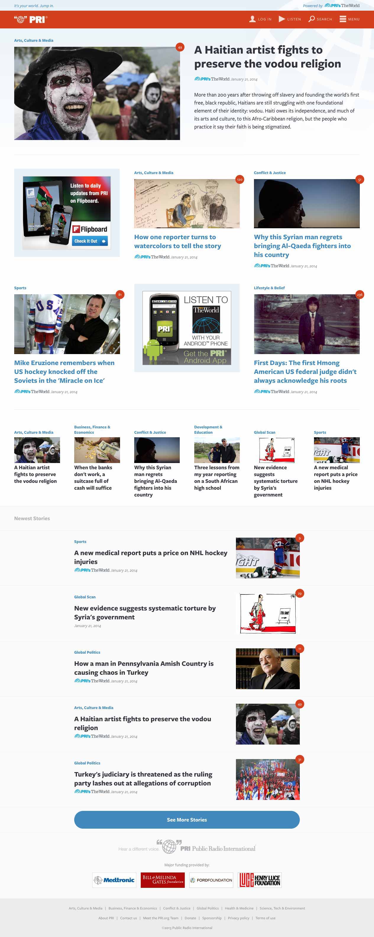
It is composed, almost entirely, of the design components we just built! (Things like the site header and footer are design components, too, just not user-editable ones.) Going down the page, we see:
- one instance of our Lead Feature design component;
- four instances of Square Featured design components (one for each section);
- six instances of an Illustrated List Compact design component (which we didn't cover above but you can easily see how it works);
- five instance of our Illustrated List design component, which look to be arranged in a list.
Look carefully and you can see some stories appear multiple times on the same page, in different places, in different design components. That’s OK. In fact, that’s normal, if appropriate for our business logic.
Isn't that a lot of work to go through for a home page? It is, but remember that a web site is more than a home page. Once your design components are defined, creating more templates is a breeze. Consider this section landing page:
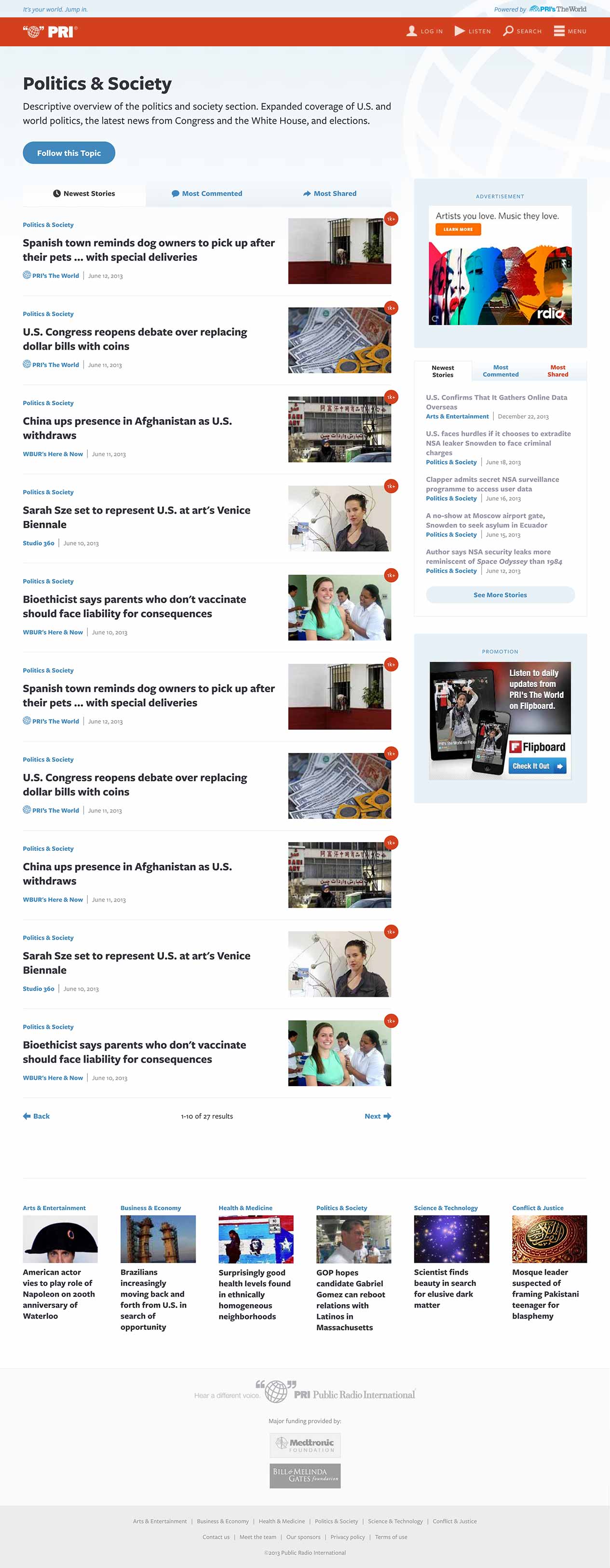
Notice that list of articles? Looks familiar, doesn’t it? That’s because it’s the exact same Illustrated List design component. The "newest stories" block on the right is the Compact List component we built earlier. Because it’s the exact same design component, it looks exactly the same, which is good for predictability and usability. It even has the exact same CSS, which means less work for our front-end developers.
The more you use design components, the easier they get. And the bigger your site, the more time they save.
How do we build templates in Drupal, though? There are multiple tools available, but for this sort of work the best by far is the Panels suite. Panels gets a bad rap at times because of its often cludgy UI, but it is in fact designed for building exactly this sort of design.
Take a look at the home page again, and mentally block out the content itself. You’ll see there’s a very clear skeleton to the page: A top region (into which the Lead Feature goes); then, six equally sized spaces for Square Featured content or ads; then, a row of six spaces; then, one big space. That’s our "content area" template, or, in Panels-speak, a layout. Layouts are very simple to define and are really just a template with regions and CSS. The Panels UI lets us select a layout, then pull content into it in various regions. Usually, Views "content panes" makes a good mechanism for that to allow the content to self-update. In this case, we'd have a view for the Lead Feature, one view used four times with different arguments for the Square Features, either one or six views for the Compact Illustrated List area (depending on what the rules are for what stories appear there), and one view for the Illustrated list feed below that. Bim-bam-boom, we have our page assembled!
Responsive (Re)design
Design components make responsive design easier, too. Since each component is styled independently, it can have its own breakpoints. Perhaps an Illustrated List gets ugly below 500 pixels wide, so we set up our CSS to wrap the text below the image under that size. The Lead Feature, however, works well down to 400 pixels so it doesn't change its layout until then. Neither of those affect the overall page layout. The page layout, however, can start wrapping the Compact Illustrated List components at 600 pixels, without affecting the layout of individual components.
Rather than three big breakpoints with three big designs, we have a component-based design that scales up or down to any arbitrary size, and we are confident that it will work with whatever screen size is thrown at us.
In fact, we know it will work when used in different contexts, too. Suppose that a year from now, PRI rolls out a new feature that requires a list of stories. They now have several pre-built design components to choose from that they can simply toss into a new layout using Views and Panels, confident that they will look good immediately.
A design that is easy to build, easy to make responsive, easy to extend without writing code, and lends itself to good usability and learnability for site visitors?
That's designing for Drupal.
Further reading
Image by Kamil Porembiński is licensed under CC BY-SA 2.0