
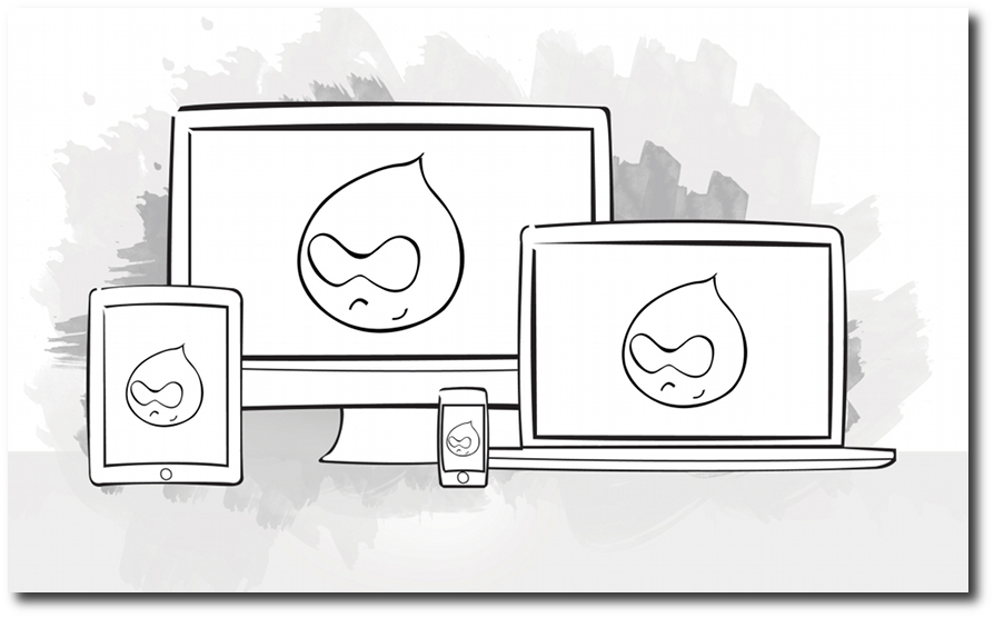
It’s 2011, and the world is going mobile. People don't just use their desktop computer or laptop anymore to visit the sites you build. They're coming at you with smartphones, tablets, TV screens— and who knows what they’ll bring next year? With all this device-switching going on, one of the questions that site builders ask themselves is, how can we keep catering to all these different devices? The good news: There is a way. It’s called responsive webdesign.
In this article, we briefly lay out what responsive webdesign is, and, more importantly, how you can use it in your Drupal projects today.
What is responsive web design?
In his 2010 article on 'A List Apart', Ethan Marcotte coined the term "responsive webdesign," referring to responsive architecture. If architects can design rooms that change according to the number of people inside them, why can't web designers build web pages that adapt to the people who view them?
 As you may have guessed from the name, responsive web design is all about, yes, responding to the site user's device specifics. Does the device have a wide or narrow screen? How is the user holding the device? What OS is powering the device? All these questions determine how the user experiences your website. With responsive webdesign, you can accommodate all these possible differences.
Using a combination of CSS3 media queries (which query the device's capabilities to determine the proper stylesheets to load), a flexible grid acting as the site’s foundation, and images that change according to the screen resolution, responsive webdesign allows you to work in a so called "device agnostic" way. It doesn’t matter whether the user has the latest tablet, or an early-adapter smartphone: if your design is responsive, it can adapt to the user. Think of it as a fluid (vs fixed) webdesign on heavy steroids.
"This is our way forward. Rather than tailoring disconnected designs to each of an ever-increasing number of web devices, we can treat them as facets of the same experience. We can design for an optimal viewing experience, but embed standards-based technologies into our designs to make them not only more flexible, but more adaptive to the media that renders them." (Ethan Marcotte)
The tools
Let’s look at the most important components of a responsive webdesign, and how these could be applied in a Drupal project. It is important to note here that most major browsers support these techniques today—and yes, there are multiple Javascript tricks around to make IE play along.
1) CSS3 media queries
As most site builders among you already know, CSS2 allowed you to serve different stylesheets based on media type. For instance, you could load a stylesheet when the user looks at the site on a desktop computer that is different from when the page is printed out or when the site is visited using a handheld device.
CSS3 however, adds some interesting new possibilities to the mix: media queries. Media queries allow you to actively query a device for specifics like screen resolution, device orientation, color depth or the type of screen. Armed with that information, you can present suitable stylesheets for each device.
Using media queries in your Drupal theme is a breeze. Previously, when you included a stylesheet in your theme for all media types, your theme's .info file would contain something like:
Now if you would like to load a different stylesheet when the user holds his device horizontally, you can add something like:
That’s all there is to that part. Of course, before doing so, you need to sit down and plan your different stylesheets and how you want to adapt your design to different devices.
2) Flexible grids
Another key component of responsive webdesign is building your design on a grid that can adjust to different environments. Using grids is pretty common practice in webdesign these days, especially if you're working with heavy content-driven websites: it allows you to lay out your design elements in a structured way to create sites that are easier to understand by your visitors. All too often though, those grids still limit themselves to a fixed-width lay-out—as do a lot of Drupal themes.
Using a flexible grid, where you define your elements proportionately (to its container) rather than fixed, the design is allowed to change according to the user's screen size. This is a fundamental part of any responsive webdesign, since we want the site's look & feel to adapt to the device capabilities. Equally important, it makes it possible to use the same base design structure (the grid) across different possible environments (a wide screen desktop monitor vs. the small screen of a smartphone).
Using a fluid grid is mostly a matter of writing the right stylesheets, so there is not much Drupal-specific to this. There are, however, a number of grid frameworks out there that make the creation of a grid easier, such as the Less Framework. Based on this framework, Jochen Verdeyen (Drupal.org user profile: jover) started the Fless project in his Drupal sandbox, a Drupal base theme.
Another interesting theme to watch is the Omega theme, developed by Jake Strawn (Drupal.org user profile: himerus). A combination of the 960 grid system and HTML5, it is a highly configurable theme, and its 3.x version is fully responsive.
3) Flexible media
To make a responsive web design work well, you also need to be flexible with your images and video: a widescreen desktop monitor has display capabilities different from a smartphone’s screen, so that difference should be taken into account.
One method is to tell your images to have a maximum width of 100%, so they always stay nicely within their containing box. This technique works pretty well for video too. The only downside is you are serving unnecessarily heavy files to some devices.
A solution for this problem comes in the form of a bit of Javascript and the HTML5 attribute "data-fullsrc," which allows you to define an alternate image file in an img tag. Using a Javascript and an .htaccess file, authored by the Filament Group, the large image will load in screen resolutions over 480px wide. By using this Javascript technique, you address one of the main performance concerns about responsive webdesign.
Sven Decabooter (Drupal.org user profile: svendecabooter) started a module based on this idea. He provides an imagefield formatter that makes it possible to upload a small and large image, which will be served to small screen and large screen devices respectively.
A responsive Drupal core?
With all this responsive hotness in Webland, where does Drupal (core) stand? Right now, you have to help yourself with the options listed above (in some cases, still experimental), and other projects out there trying to make responsive Drupal websites easier to build.
More interesting though, are the plans of the Drupal 8 Design Initiative to use responsive methods in the development of a new Drupal core theme (to be added to Drupal 8), and thus have Drupal core itself make responsive web design easier. Aside from this, as we heard from Design Initiative lead Jeff Burnz, Bartik & Seven, the new core themes that were added to Drupal 7, will also be enriched with responsive techniques in Drupal 8. The toolbar and the shortcuts, both newly introduced in Drupal 7, will go down the same path. If you want to follow along, or maybe even help drive this home, check out the Design Initiative’s Drupal group: http://groups.drupal.org/design-drupal/d8di.
Needless to say, we have some very interesting times ahead of us when it comes to responsive webdesign and Drupal. A lot is already possible, and the plans for Drupal 8 (also including the HTML5 initiative) seem to bode well for building responsive websites with Drupal. This is a great approach to go forward with mobile and Drupal: Build one website and offer your visitors excellent experiences, no matter what device they throw at you.