
Among the many new features shipped with Drupal 7 is the first release of “Field”, an innocuous sounding module that purports to let users “add fields to entities like nodes and users.” Bearded developers of Drupal will respond with “oOOooh, an official Flexinode!” whilst slightly younger members will glee at “CCK in core!” Regardless of your heritage, the ability to customize your inputs for content types, comments, and users is now built-in to Drupal 7 and this article will take you on a quick whirlwind of its end-user UI.
I’m going to assume that you’ve started out with Drupal’s “standard” install profile, so all click paths will start with “Toolbar” to represent the upper black menubar. The “standard” profile also enables all the modules you need, but you can double-check by heading to Toolbar » Modules and ensuring that Field, Field SQL storage, File, Image, List, Number, Options, and Text are all enabled. These modules will provide you with several basic field types. If you want node and user references, you'll need the References module, which offers a Field-specific port of CCK’s Node and User Reference, allowing you to link nodes and users to other nodes and users.
Once you’ve confirmed the Field and related modules are enabled, navigate to Toolbar » Structure » Content types to get a list of your installed content types. We’re going to add some new fields to Drupal’s standard “article”, fiddle with their configuration and visual order, and then tweak how they’re rendered to your visitors. To get started, click the “manage fields” operation for the “article” content type. You’ll be presented with the screen below.
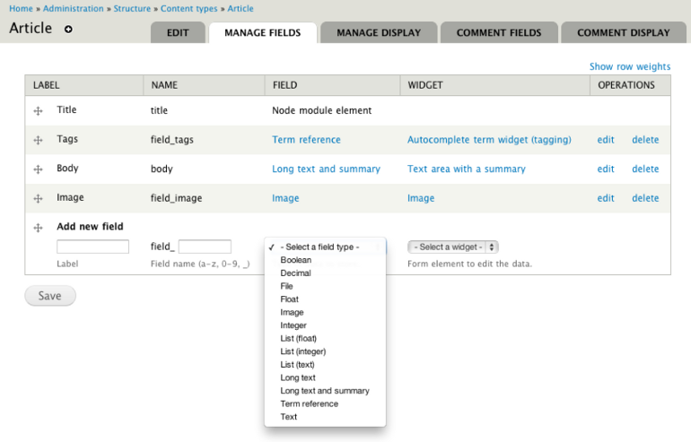
You should notice that a number of fields are already defined. Fields have a label that is shown during content creation, editing, and optionally, rendering, as well as a name or machine name which represents the field at the database level. The field type determines what kind of data this field stores (text, numbers, etc.) whereas the field widget determines how the data is entered (via checkbox, text field, options list, etc.) The available widgets are constrained by the type of data you’re storing.
Text field types
Let’s go ahead and create a new field labeled “Co-authors” with a field name of simply “coauthors”: this will set the internal machine name of the field to “field_coauthors”. Fields created with the Field UI module are always prefixed with “field_”, whereas those created programmatically don’t have the same restriction. The purpose of this new field of ours is to allow you to add the names of any co-authors to an article when you create it. Since this is text-based input, we’ll choose “Text” from the field type menu, and you should notice that the Widget drop-down is now pre-filled with “Text field”. Click “Save”.
You’ll next be presented with a type-specific “Field settings” screen that controls the default configuration for the entire field regardless of where it appears (on a single content type, on multiple content types, on users, on comments, etc.) Click the “Edit” tab to see a much wider array of options, starting with settings specific to this field instance. A single field can have multiple “instances” of itself: that is, the same data storage can be attached to multiple types of entities with different labels, help texts, required status, and so forth. Even the field widget, which determines how the data is entered, can be configured differently on every entity to which it is attached.
This “Edit” tab will look basically the same from field to field, though some field types have additional options that we’ll call out as we get there. When you’re first setting up a new field, don’t hesitate to experiment with these settings until they’re just right. Having one browser tab open to the field’s Edit, and another tab open to the “Create new [content type]” form allows quick experimentation; make an adjustment in the settings and refresh the form tab to see what has changed.
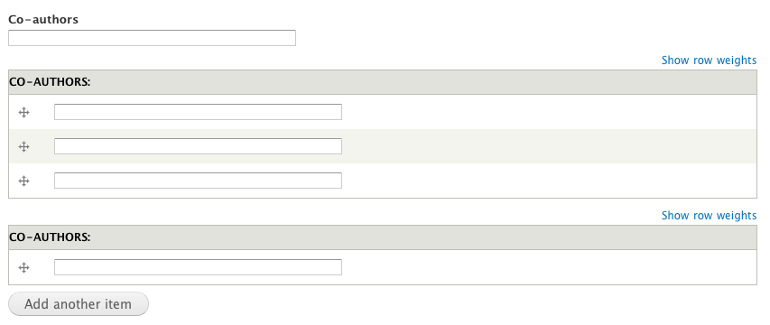
If you do that now, you’ll notice that the current Co-authors widget is just a single text field. This isn't very helpful if an article has more than one contributor. To fix this, go back to the field’s “Edit” screen and tweak the “Number of values” setting to, say, 3. Save your changes, refresh the “Create new [content type]” form, and you’ll see that multiple entries are now allowed. Alternatively, if you’re running a research journal that requires the ability to define dozens of co-authors, you could set the “Number of values” to “Unlimited”; the following screenshot illustrates these three options.
There are three default text field types shipped with Drupal 7: text is the first, and “Long text” for paragraphs or multiple lines of data, is the next. The third variation, “Long text and summary”, allows you to input a large body of text, but then “split” it or otherwise summarize it in a separate field (similar to how the node body and teasers work).
Decimal, float, and integer field types
If you need to store number-based data, then decimal, float, and integer are your field types of choice. Let’s create a new field with label “Cost”, name “cost”, and type “decimal.” The only widget available for numbers is “Text field” so click “Save” to be presented with the “Field settings” tab. This field is going to represent the amount of money we’re going to pay for an article submission, so leave the “Precision” as 10 but tweak the “Scale” to 2; this lets us store a number like 12345678.90, which is a precision of 10 total digits with a scale of 2 digits to the right of the decimal point.
Number-based fields have a few of their own specific configuration options, so when you save this first step, you’ll be brought to the “Edit” tab where you can set minimum and maximum values and prefixes and suffixes. Since we want to accept free articles, we don’t need to set a minimum value, but our budget might require us to set a maximum of 667.01. We’d also set the prefix to the US Dollar sign ($).
Boolean field types
Now we need to add a bit of workflow: a field that allows us to set whether the article has been peer-reviewed or proofread. Let’s create a new field labeled “Proofread or peer reviewed?” with a field name of simply “sanity_check”: this will set the internal machine name of the field to “field_sanity_check”. When you choose “Boolean” as the field type, you’ll notice that the widget dropdown is now filled with “Check boxes/radio buttons” and “Single on/off checkbox”; for now, choose the latter and click “Save”. Since our intent is a Boolean on/off field, the default values of 0 and 1 are perfect, so move on to the “Edit” tab. For a “single on/off checkbox”, the most important tweak is “Use field label instead of the “On value” as label”. Without this checked, the new field would appear on our form as just a lonely checkbox.
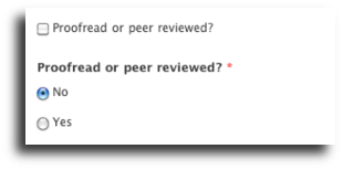
Let’s demonstrate another approach where we would want to have the values appear and not the field label. Click the “Widget type” tab and change the dropdown to “Check boxes/radio buttons”. Edit the field again, head to the bottom of the form, set the “On value” to “Yes” and the “Off value” to “No”. Since “Yes” and “No” pretty much cover all the possible choices for this field, we can also toggle the “Required field” checkbox. Save the field and refresh your “Create new [content type]” tab; the screenshot to the right compares the two approaches.
List field types
The last field type we’ll go into depth about is a “List”, which gives us the ability to define multiple things to select from in a variety of widgets. We’re going to create a “List (text)” field with a label of “Section” and name “section” – our intent here is to allow our writers to define which “sections” of the magazine or web site their article should fit into. For the widget, let’s start with “Select list”.
Lists are probably the most obtuse to setup, primarily because their most important configuration lies in a gigantic text area called the “Allowed values list”, which is the first thing you’ll see after saving the field. The easiest approach is simply to list, one per line, the labels you’d like to show to the user. If we put “Editorial”, “Features”, and “Back page” onto three lines, then those are the exact values that’ll be saved into the database when a user creates a new article. But what if we needed to store “editorial”, “featurewriteup” and “back-page” as the database values instead? To do so, we’d put the following into the “Allowed values list”:

featurewriteup|Feature
back-page|Back page
Save your changes and refresh the “Create new [content type]” form: you’ll see that our “Section” dropdown obediently appears near the end of the page.
There are multiple ways to tweak the visual appearance of this widget. If you set the “Number of values” to Unlimited (or any other number besides 1), the dropdown will turn into a select list that accepts multiple clicks. If you change the widget type to “Check boxes/radio buttons”, the appearance will again tweak based on the “Number of values” – if it’s just 1, you’ll have radio buttons; anything else and you’ll get checkboxes. Setting the “Required field” checkbox will get rid of the “N/A” or “- None –“ option.
Term reference, file and image field types
The remaining field types we haven’t covered all have their own unique configurations, but the internal help text and preceding walkthrough should be enough to get by. “Term reference” field types are just like Lists, only their data is sourced from an existing taxonomy vocabulary; a standard install of Drupal 7 pre-creates a term reference field labeled “Tags” for the article content type. This same content type also has an “Image” field, which is just a “File” field type with more options, like minimum and maximum image resolutions, alt and title attributes, and default image styles from Toolbar » Configuration » Media » Image styles.
Tweaking the display
We’ve finished creating all the fields we need for our embellished article content type, but there’s still a bit more tweaking we can do: specifically, the order in which these fields display and exactly how and what they reveal.
To change the order of the fields, we can simply go to the “Manage fields” tab and drag the handles (to the left of the label) up or down to reorder the fields. Immediate changes will be shown in yellow, with all changes indicated by an asterisk after the label. Don’t forget to click “Save” to enact your changes. Note that changing the order on the “Manage fields” tab will only affect the data entry forms: if you want to tweak the ordering of the fields as seen by your readers, you’ll need to click the “Manage display” tab, which is the central location for all Field UI display settings. The following screenshot shows a sample article with the fields ordered differently than how they were created.
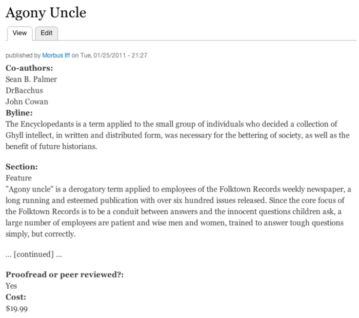
This isn’t as pretty as we’d envision, so let’s continue fiddling with “Manage display”. First, we don’t need “Section” or “Cost” showing: we don’t want to tell people how much we paid for a piece, and “Section” might be mostly syntactic sugar to hook into custom displays with the third-party Views module. To get rid of these fields in the rendered node view, set the “Format” to “”. Next, the “Proofread or peer reviewed?” line is a little bulky, so we’ll switch the label to “Inline”: this causes the field value to be displayed on the same line as the field label. Finally, we don’t really like seeing the “Byline” word displayed, so we can set the label to “” while leaving the “Format” alone. We’ll also move the “Co-authors” further down just to get a better lead-in to the actual content. When you save all these changes, we’ll get the following revised display.

You can also tweak the appearance of the content as it appears in the teaser, RSS, or the search indexes and results, if those particular features are enabled. Of course, if you need even stronger capabilities, you can always dip into the raw internals at the module or theme level, but to minimize your code and effort, try to get a decent base from these Field UI tabs first.
Reusing fields and adding to users or comments
This article centered upon creating and editing fields attached to the Article content type provided by a standard install of Drupal but, once a field is created, it can be reused as you’d like. If we wanted to add “Proofread or peer reviewed?” to the basic page content type, we’d simply select it from the new “Add existing field” that appears on every “Manage fields” tab. We could change the label, switch the widget, or add more help text, and those tweaks would be unique to the basic page’s field_sanity_check field instance, whereas the data storage and available values would be consistent between articles and basic pages.
We can also add or reuse fields to users, a new Drupal 7 approach that replaces the good ol’ days of the profile.module. You can get started with that, using the same interface described herein, at Toolbar » Configuration » People » Account settings » Manage fields.
Finally, fields can be added or reused on comments, as well… and not just comments as a whole, but comments specific to a content type. If we wanted to add a new field to comments left on our article content type, but not have that field appear on comments left on the basic page content type, Drupal happily obliges. To get started there, head to Toolbar » Structure » Content types, click “Manage fields” on the type you’d like to tweak the comments of, and then the “Manage comments” tab. Splitting comment fields up by content type is powerful but it does mean, unfortunately, that if you’d like to add the same field to 20 content type comments, you’ll have to add it once, then “Add existing field” 19 other times.
With Fields in core, the Field UI does its best to bring data storage creation, reuse, and rendering tools to end-users. At first blush, it can be a bit confusing and complex, but once you’ve mapped a model in your head to Fields once, it’ll only get easier.